The Front of House Project
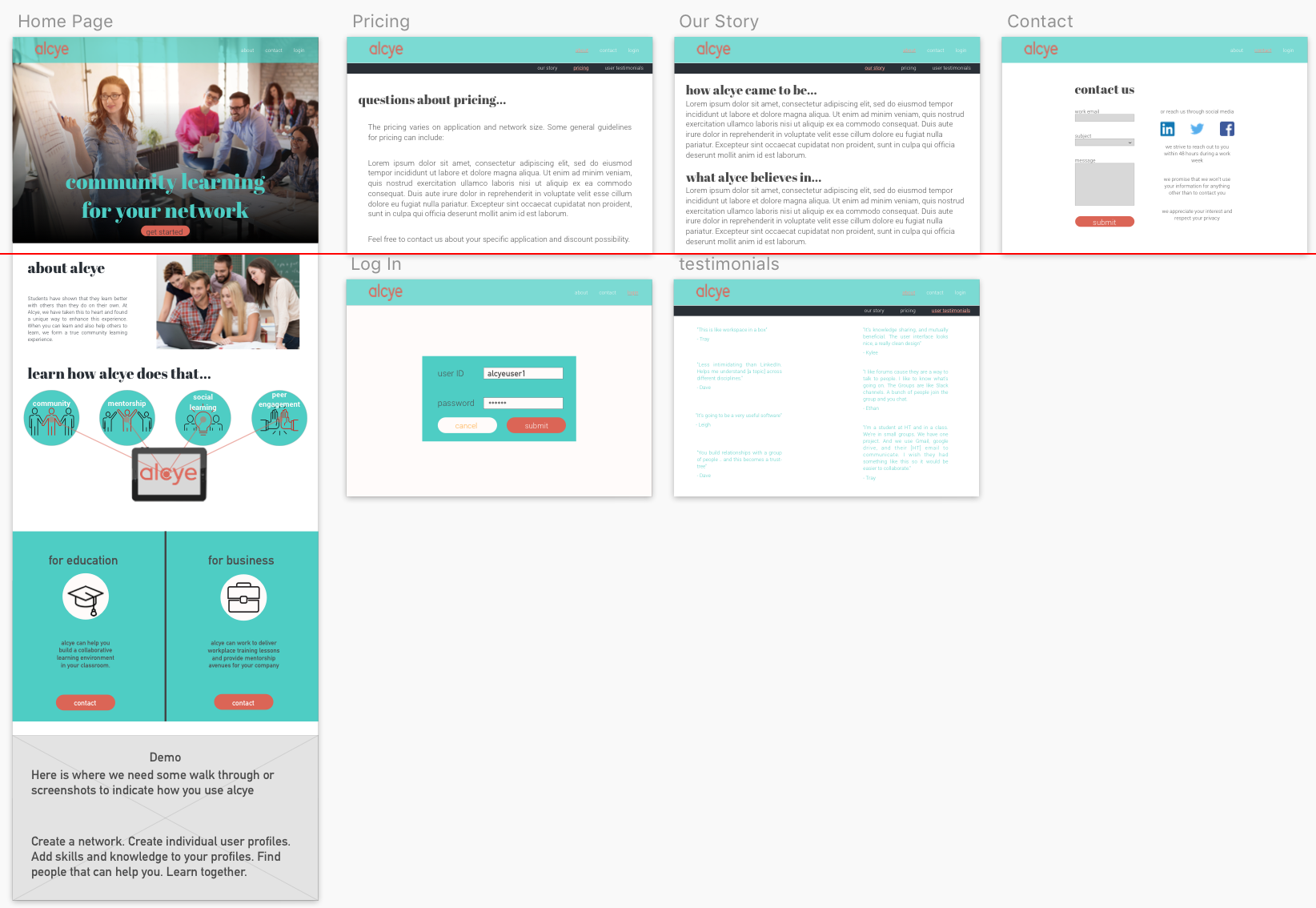
On the left is the actual website and the one on the right is the redesign that I completed in Sketch and Invision. I will detail the rationale behind the changes to the imagery and content below.
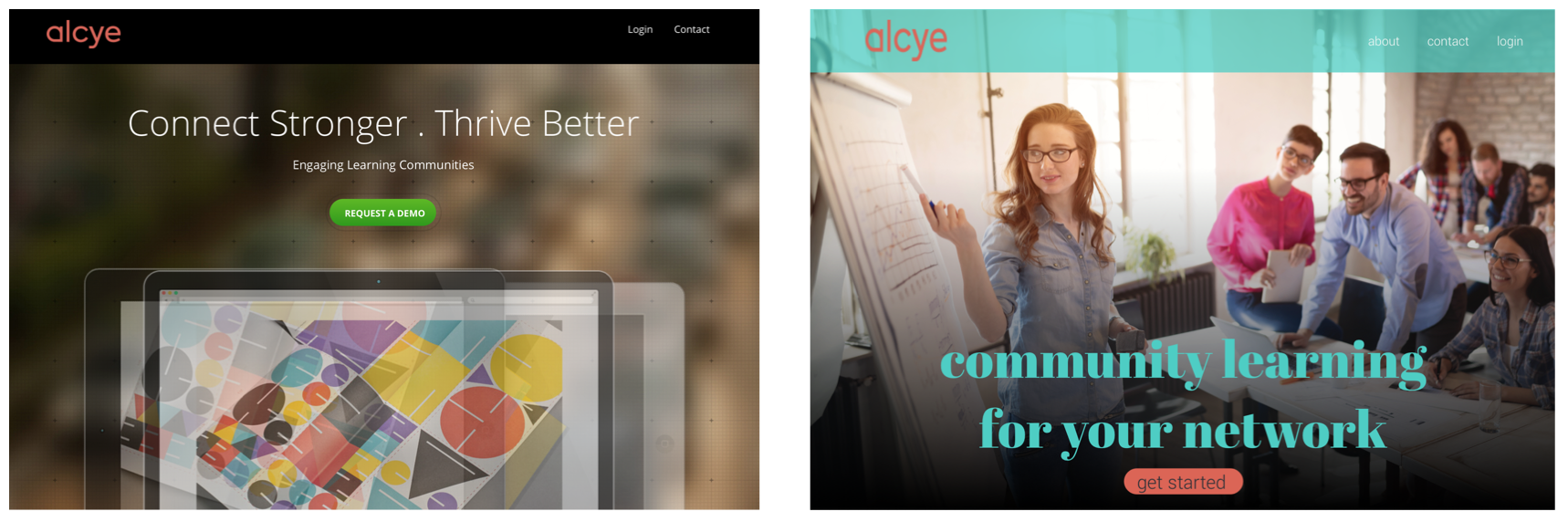

On the left is the actual website and the one on the right is the redesign that I completed in Sketch and Invision. I will detail the rationale behind the changes to the imagery and content below.
To prepare for the project, we were given a project brief. This included expectations and deliverables. We also knew that we would be having a meeting with the owner. We were the second team and were in charge of “front of house” work, while the other team was tasked with “back of house” work. This means that we were in charge of everything a user does before logging in, and they were in charge of everything after logging in.
We had a joint meeting where the first team talked to the owner and developer first, and we talked to them second. We were in the same room, so we got to gleam some information from the first meeting. After we went through our welcome presentation and what we would be doing, we did some exercises with the owner to determine some directions of where the project would go by doing things such as having the owner do a drawing of the typical user and labelling information about them. Later on, we gave them style tile questions to gleam some extra information about their vision of what the site should look and feel like.
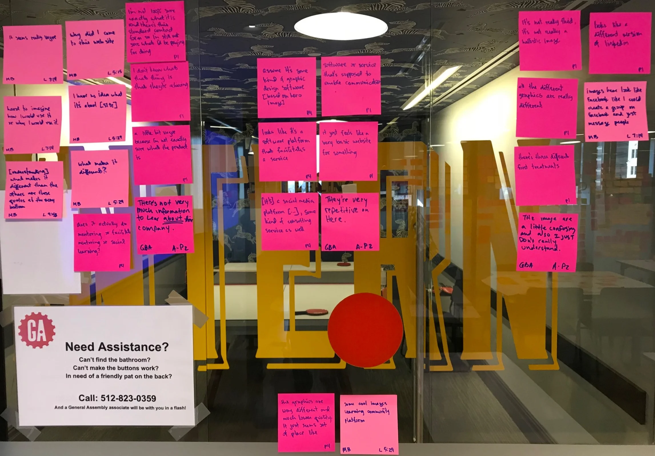
We started with traditional items such as Heuristic Evaluation and SUS. These diagnostics and the feedback from users confirmed with we believed to be true. Users stated that the hero image is confusing and does not convey the spirit of the site. The text is hard for our users to understand, and in many cases it’s so dense that they don’t read it at all. The graphics were called inconsistent and confusing. The style changes throughout. The colors are not part of a scheme and are inconsistent. Most importantly, users did not know what it was that they should be doing on the site, how they would do it, and what it took to get started.
Role: conducting invterviews, transcribing, pulling quotes
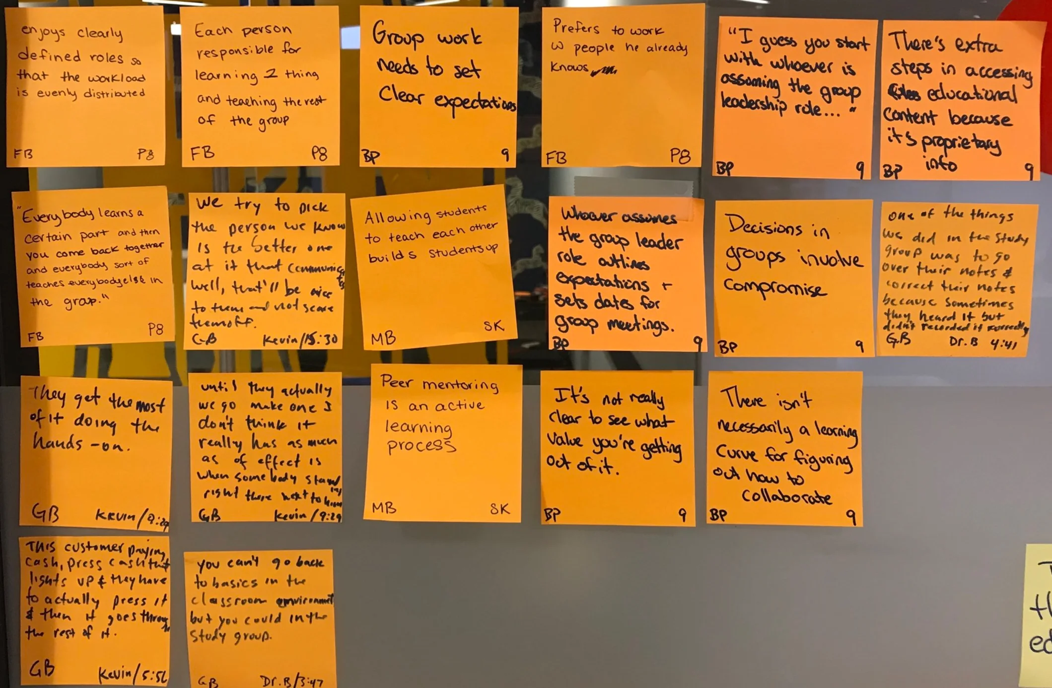
After the Heuristic evaluation, we completed a small SUS testing. Through these interviews we got a lot of information about what they felt about the site, what their confusion or questions about the site were, and how effective the site was. These are some of those quotes after some early affinitizing.
Role: pulling quotes, affinitizing
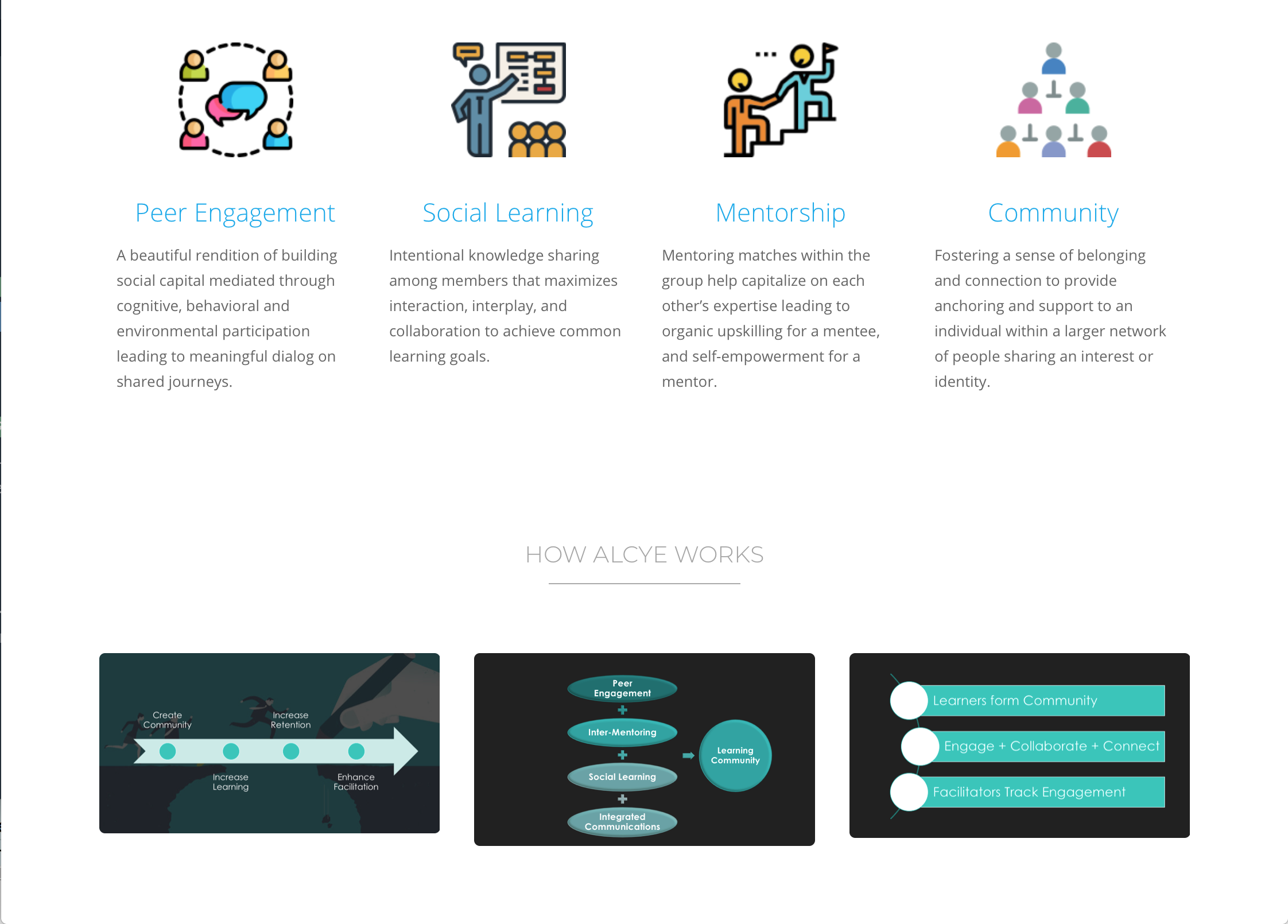
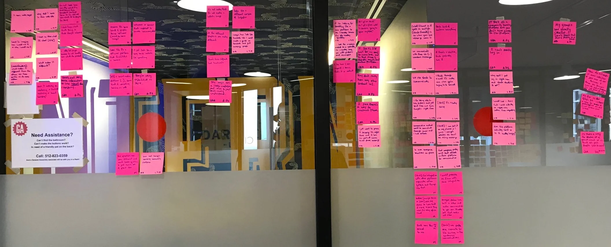
We kept doing interviews to try and get more information about what we needed to do. The problem with this is that we knew what was wrong, but we didn’t really have insight into how to fix it. We knew that we would need to change our strategy to get the further insights that we required. We decided to continue interviewing users, but instead of asking them about the site we would now ask them about group education and what their experiences were. In doing this, we could now determine what the best practices of group education were as well as highlighting to the potential user what they would be doing on the site.
Role: quote pulling, affinitizing
Now we are interviewing users about their experiences with group education in hopes of showing users the strengths of alcye. You may notice that the other post it notes were pink and these are orange. This is to differentiate the different types of interviews and to quickly determine what the user was talking about when looking at quotes (if it was the site or education in general).
We had people that are in classes currently, people that hadn’t been in a classroom for twenty years, and two retired educators (one from middle and high school and the other from the collegiate level). We felt pretty confident in the information that we were getting and that we could now highlight the importance of alcye.
Progressive Disclosure would be an integral part of the site development, to the point that I will create a second case study on just that aspect.
Role: conducting interviews, transcribing, affinitizing (not pulling quotes so that I had distance)
It is often difficult to explain exactly what you want. But most can explain what you want to feel like when you use the site or something else that has a look that you want.
From these questions, we would later work together with the team that was doing “back of house” operations to come up with a cohesive style guide. This will be detailed later on.
Some of the key take aways from this and speaking with the owner are:
-professional, but very fun
-soft edges and soft colors
-something you’d want to keep coming back to
Role: copywriting questions
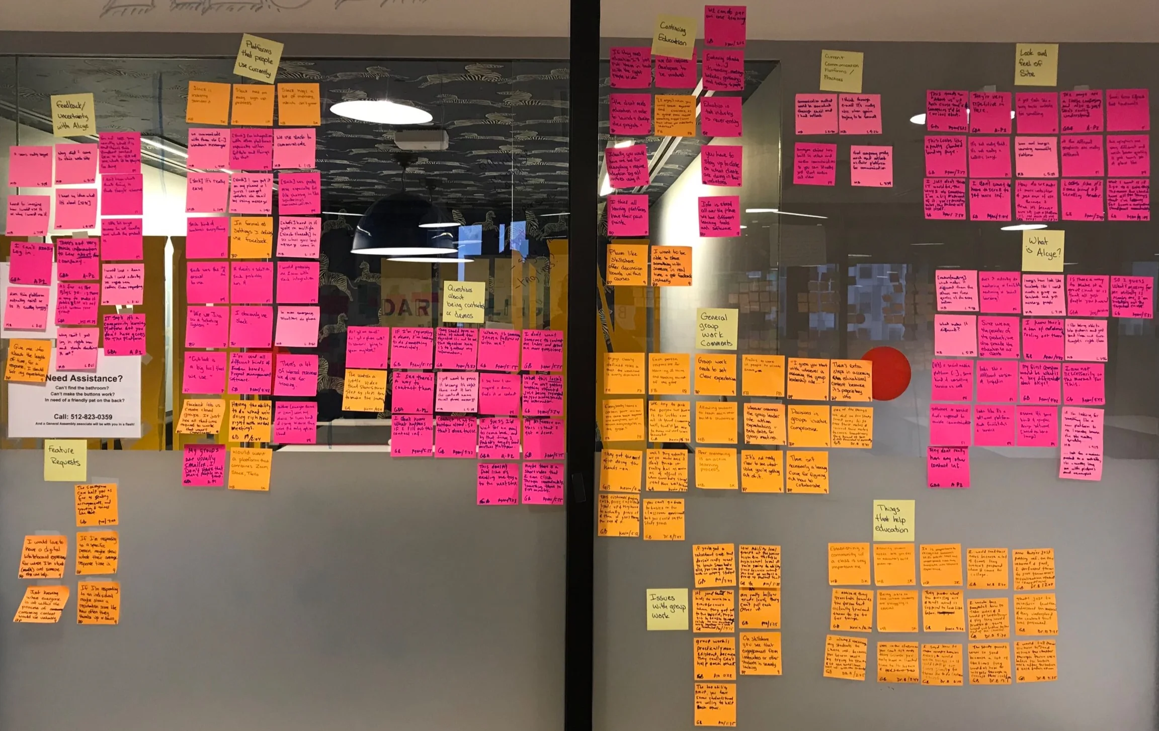
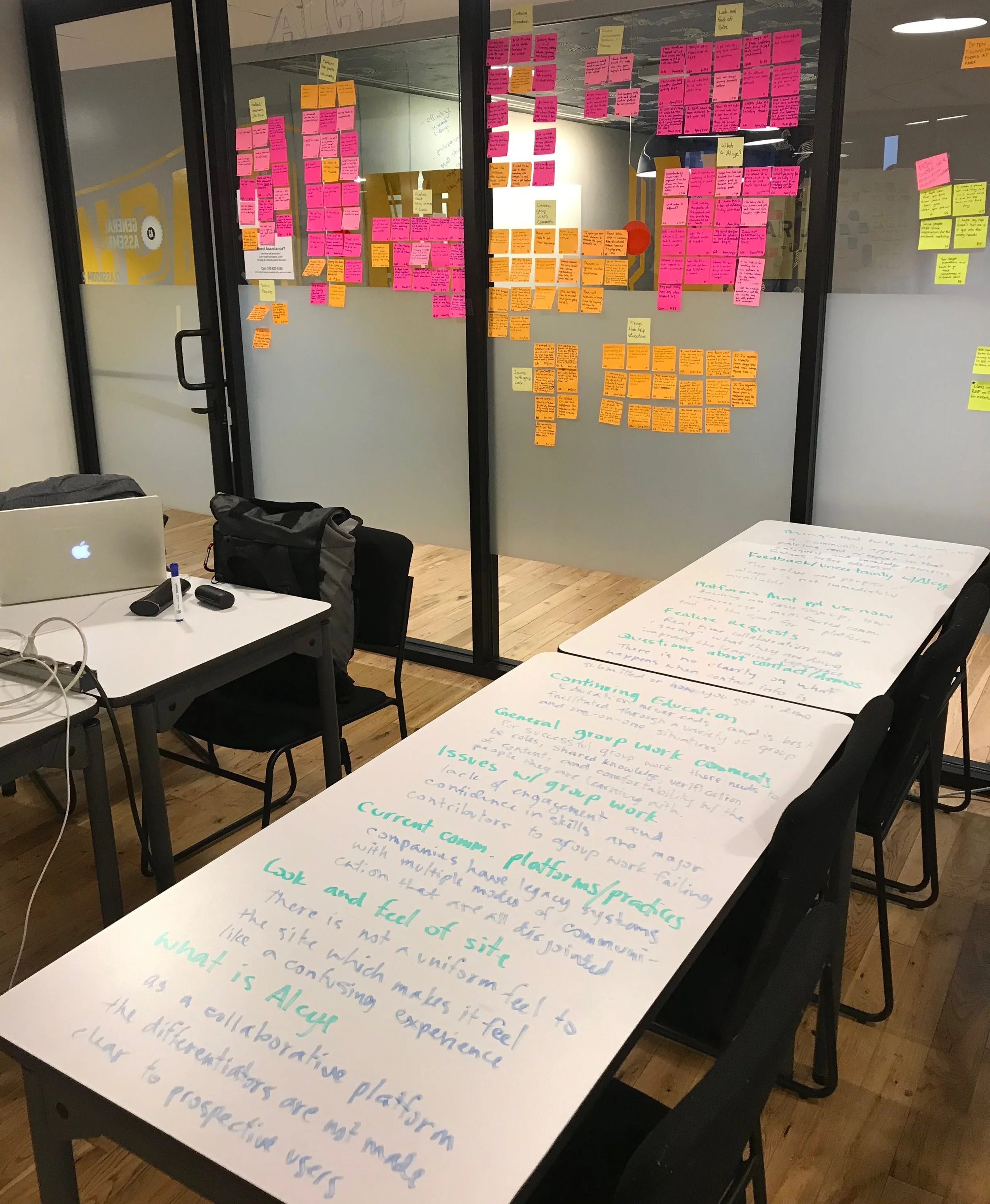
Normally, the Analysis and Synthesis process would be much more involved. In this case, we skipped things such as How Might We questions since we knew what our final product would be. This also removed a lot of this stage since we didn’t have the freedom of looking at other products, only improving the one that we had. Due to these factors, I will only detail the affinity mapping.
We took all of the quotes from our interviews and put them on the walls. We looked for common issues and grouped them together. We rearranged and rearranged and sorted them some more. Eventually we came up with some insights that are shown below.
Role: affinitized the notes as the primary, assisted by team members. Developed insights with team members.
When looking at the different categories, there has to be a reason why these things are happening. Why do these quotes belong together and why are people saying these things? By looking at the overlying issues we identified our insights that would guide us.
Normally, if we were not sure what our end product would be, we might spend more time doing How Might We statements and determining where it would lead us. Instead, we used these insights to directly look at what we would need to do to correct these issues.
Role: developed insights along with team members
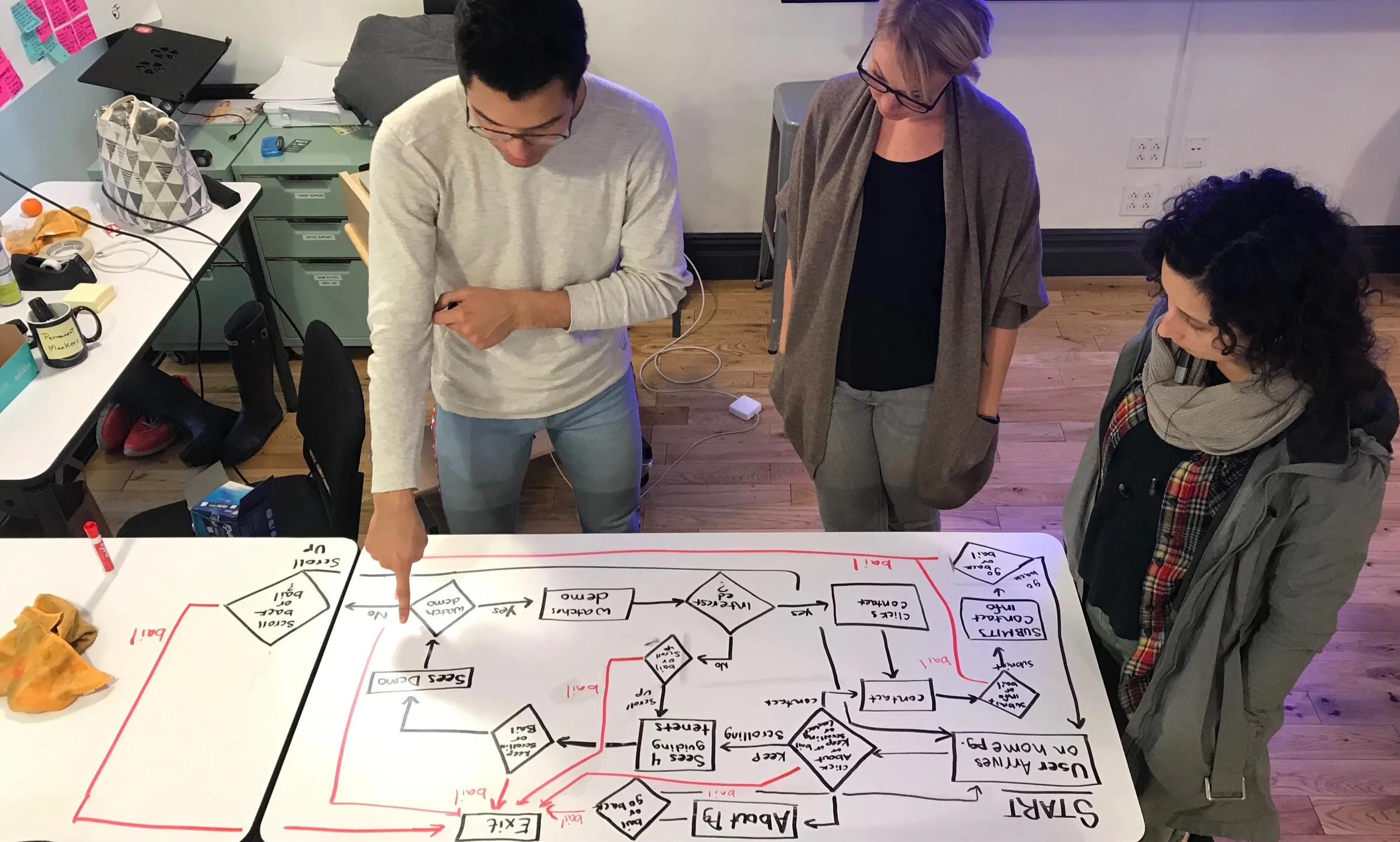
The idea of a user flow is that we can look at why a user came to the site, how they find what they are looking for, and what obstacles they will encounter along the way. There are so many possible issues to account for in representing the data and a user’s needs correctly.
When completed before the high fidelity wireframes, the user flow can be used to direct how you explain things, place things, and even what information is given (and how easily it is accessible).
Role: feedback. Team member Matthew created this and was assisted by team member Becca.
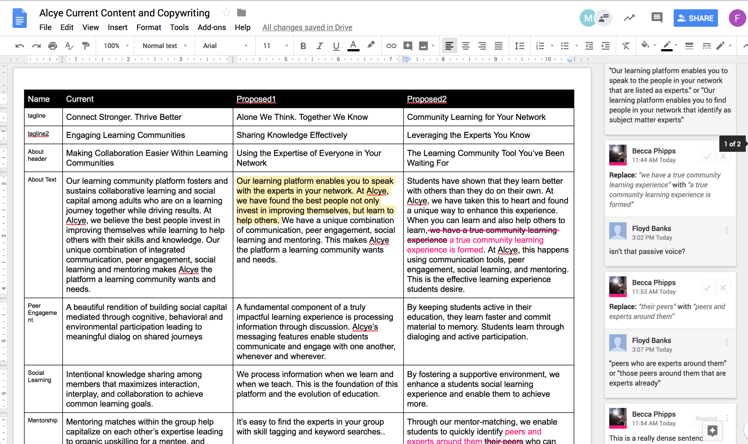
User testing showed that people did not understand the language. Tools such as the Hemingway App agreed that the language was too difficult to understand. We had to take our passionate owner’s high level thinking and simplify it to where an average user could understand. I looked at the various sections of text and item by item came up with either simplified versions or complete rewrites that explained the spirit of what was intended. Team members looked at my copy and made notes or edits. We then distilled this into the best versions possible. In the image above, most of the edits have already been made and there are only a handful of items left to adjust. This gives us something to put in front of users to see how they feel about the new copy and to make adjustments as necessary.
Role: copywriter
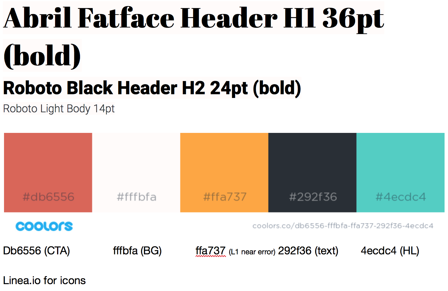
I came up with some initial options for the style guide and then worked together with Corey from the other team working on alcye to create this style guide. The header font is playful, yet professional, as well as being softer and inviting. The secondary header font is serious and easy to read. The body font is very easy to read and consistent with the second header for continuity. The colors reflect the alcye logo (the red), the beach side and yoga relaxation (the blue), and some accent colors that fit in with those.
Role: creating style guide and editing with Corey
The previous style guide would not make as much sense to our client as something more familiar would. So that they would understand what the styles are, I made a mockup of what their current site would look like with the style guide added, and no other changes. It’s easier for the brain to understand small changes at a time. If I were to put the style guide and new copy and images, it might be too much for them to process and confusing as to what they do or do not like. By doing this, they were able to understand the direction that we were going and give approval. They liked the wireframe, so that freed us to move forward with something we feel confident that would be a good product.
We ended up not using these icons, as they were difficult to parse out, and did not have symbols for the items that we used in our final prototype.
Role: sketching
We put some of our ideas into a form that we could put in front of users. We can now get feedback about what they do and don’t like about the changes we are making and also what they are expecting. We can ask “based on this text, what image are you expecting to see here?” and other questions to help guide what we create. Also, we can get feedback if their interpretation of the text is what we intended or if we need to rewrite it. These slides were completed by Becca from my team.
Role: feedback
Here, you can see the wireframes have been adjusted slightly. The first art board is now something we realize that users are not in touch with. The second art board shows how we will lay out the site. The third art board are some of the items that we will put into the site in some fashion. There are many things that we still need to determine before we will have our final site, but we have a skeleton to work from. These slides were completed by Becca from my team.
Role: feedback
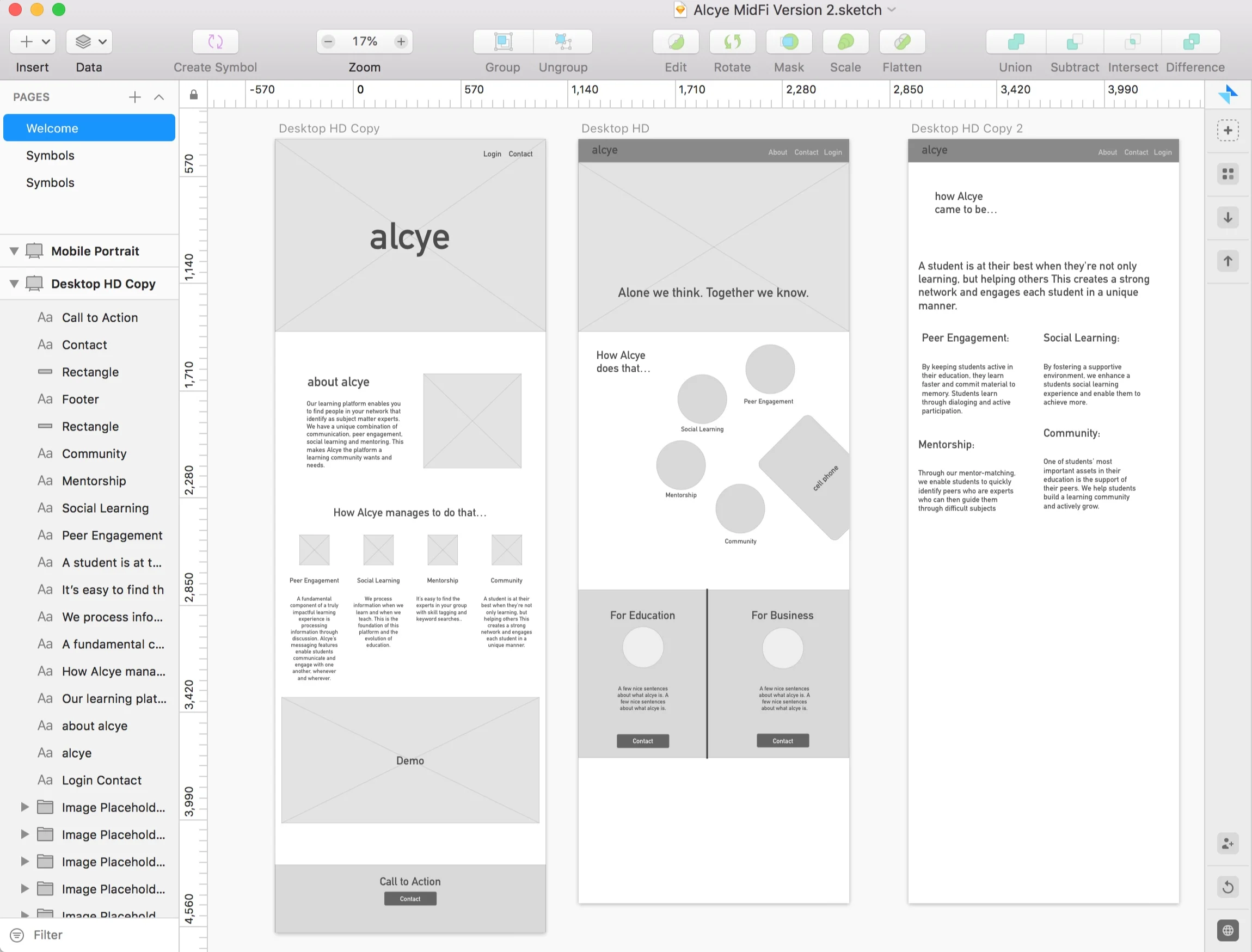
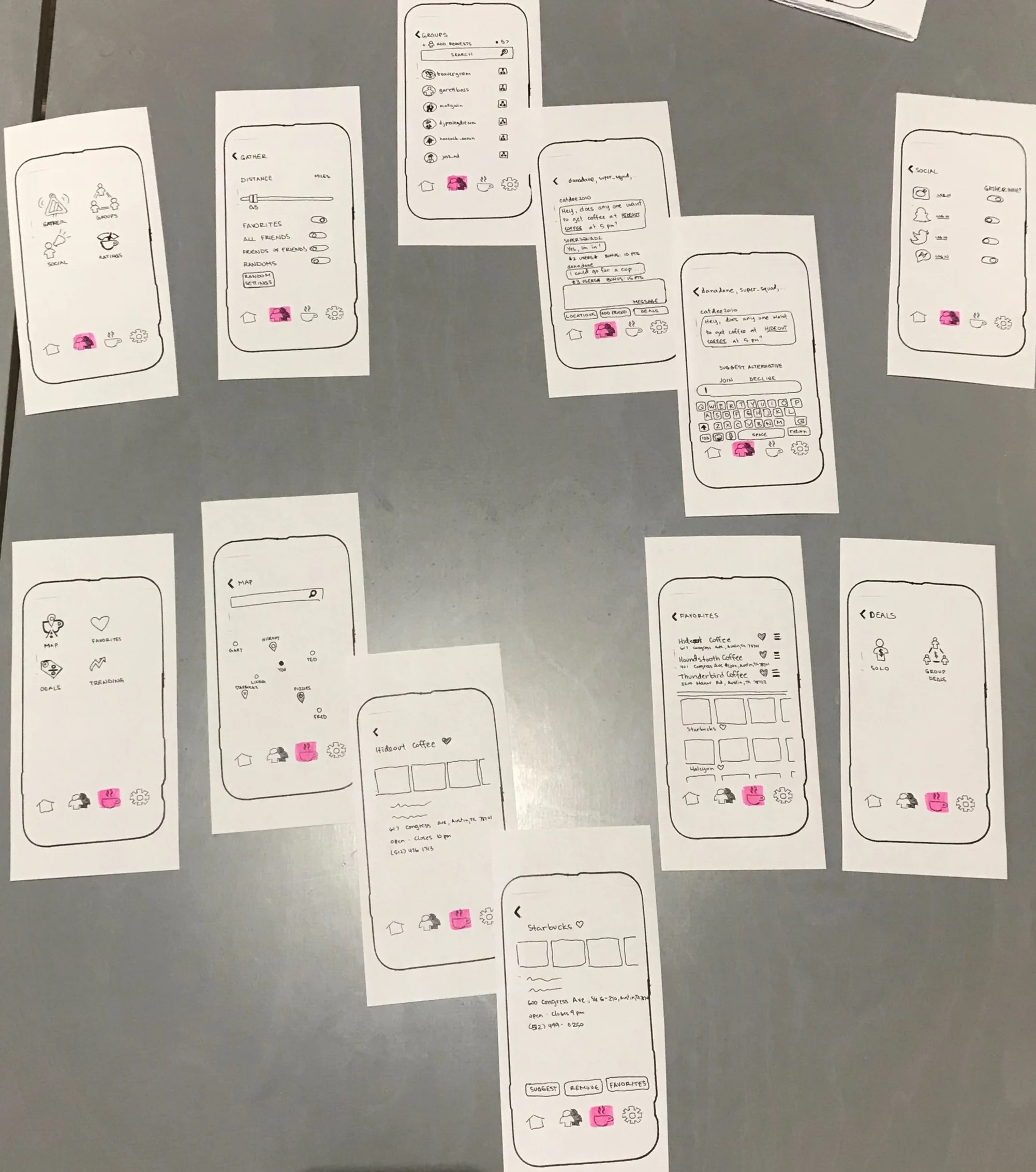
Here I took feedback from the users, from team members, and from best practices to complete the product. I used Sketch to do the wireframes and Invision to complete the interactive prototype.
You may have noticed that alcye has not been capitalized. This is intentional. Their actual logo is not capitalized, so it was a fun touch to not only not capitalize alcye, but many lines that you would expect to be capitalized. This gives a coherent feel to the site in a subtle touch.
Role: Sketching and Prototyping (solo)
CLICK HERE FOR THE INTERACTIVE PROTOTYPE
There is more copy that should be written, and more owner feedback about how they would want to demo the site to users. This feedback was requested but not obtained during the project. Overall, I’m pretty satisfied with my roles and my performance on this project.
This is a collaboration between myself, three UX designers, and a developer. Our final idea was to have a volunteer website for a corporate tree farm. What that means is that businesses would supply the trees and possibly the land and volunteers would plant the trees and take care of them. The trees would also be fruit trees so that the fruit could be donated to a local food pantry or sold at a farmer’s market to bring awareness to the cause and to bring funds back to the project. People could also volunteer to pick the fruit, transport supplies, or other needs for the tree farm to succeed.
The name came from Planet and a play on the children’s show Captain Planet and the Planeteers. But since this is a tool for planning volunteers we are Planning It, or Planiteers.
Role: facilitator (led discussions in the group) and wire framing
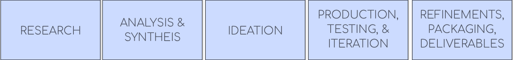
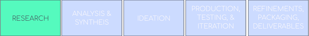
Normally the iterative process that I follow is to described in the image above:
*do research
*analyze and synthesize data
*look through the data to affinity map and ideate
*create something tangible, put it in front of users, get feedback, make changes based on the feedback, and keep doing this process as needed
*get to a point where the needs seem to be met, make the most polished version that you can make, and create anything necessary to complete the project and present to the stakeholders, etc.
For this project, things were a little different, and I’ll explain why below.
Here is where we would start looking into our existing idea, site, product, etc. to find out what is working and what users are having issues with. We didn’t have anything to start with. We were literally told “find something that is a problem in the world and solve it.” This is very vague. We had to modify our normal approach to tailor it to this situation.
Instead of analyzing something that already exists, we were analyzing the world. We needed a context to start solving a problem. Normally we would start talking about problems that already exist and choose one of them. This process seemed too daunting for our group. I suggested that we start talking about our user that we wanted to solve a problem for, and people agreed to this approach. We started explaining descriptors of our ideal person and created a proto persona.
Role: facilitator (led discussions in the group)
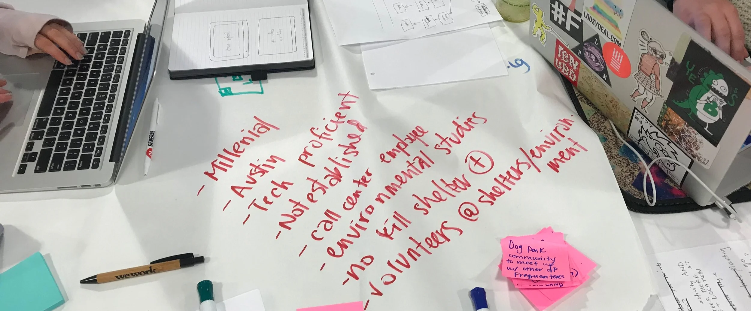
In order to get started, we decided to determine who we were solving a problem for. We talked through who our target user is, what their interests were, and what details about them would be important when designing a solution. I facilitated the persona discussion and wrote the details down for the group.
The main details that we discussed were that our millennial persona was active with environmental and animal issues. After we had these in place we needed to come up with some problems that they would want to solve and some solutions for those problems.
Role: facilitator (led discussions in the group), documented persona traits
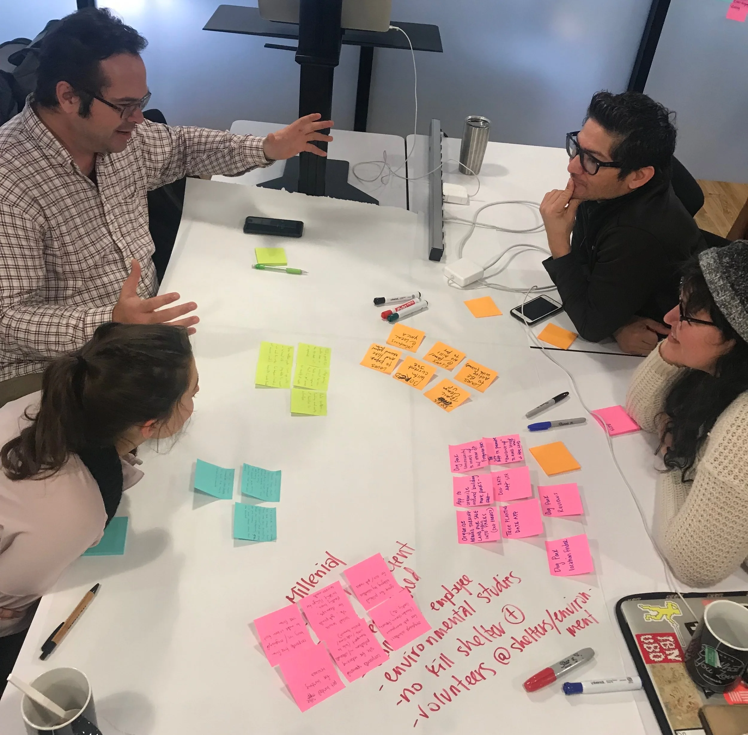
Due to the fast turnaround, we didn’t have time to do some of the lengthier processes that we would normally get into. Instead, we did two five-minute sessions of writing ideas about a solution for our persona and then presenting them to the group. After the first round, we explained these ideas to the group. Then we did a second round. After we had all of our ideas on sticky notes and explained them to the group, we did a silent dot voting. By doing this, we were not influencing others based on anything other than what ideas we felt were the best.
Role: facilitator (led discussions in the group)
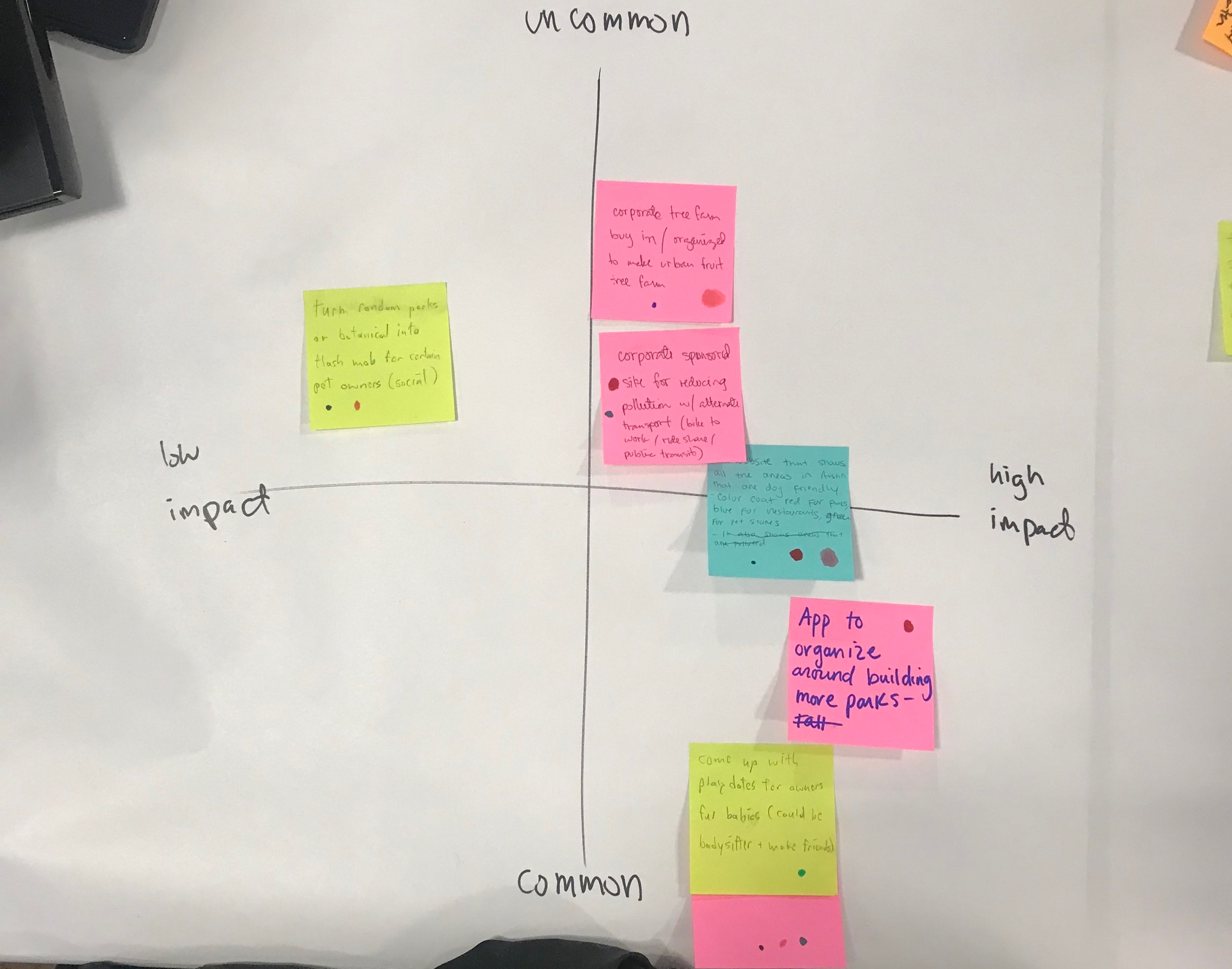
Here, we placed the ideas that got at least one vote onto a chart. We talked about where they belonged and as a team came to agreements about each thing. If someone did not agree with a placement then they would state why and as a group we would make a decision. We didn’t have any issues with placing these, but if we did we would have defaulted to our developer who was more objective in this process and also had an eye on what could be completed in our time allotment.
Role: facilitator (led discussions in the group)
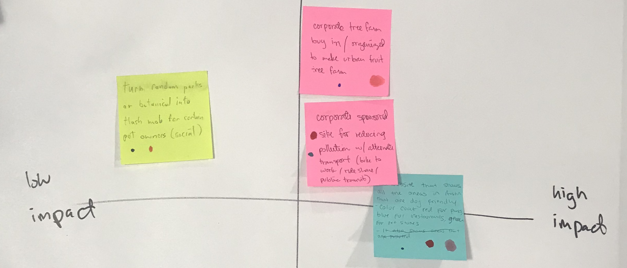
After we did silent dot voting and arranged the ideas on our chart, these are the final three ideas. The corporate tree farm, a transportation based pollution reduction site, and a dog-centric mapping tool for finding specific items. Ultimately, our developer indicated what could be done in the time we had available and steered us towards our final idea of the corporate tree farm. The dog-centric mapping was also fairly similar to features available on existing platforms and not different enough to move forward, as well as too time consuming. The pollution reduction site would require far too much back end to even have the appearance of functioning. Everyone was on board and we started moving towards that goal.
Role: facilitator (led discussions with developer and team about resources)
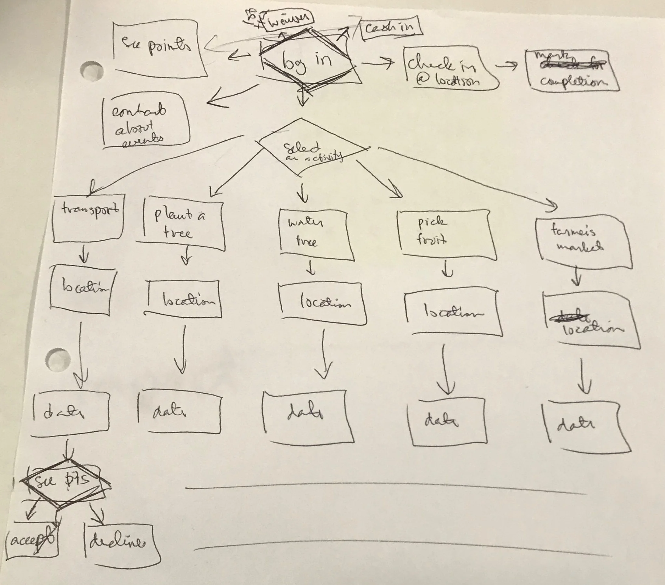
Gerald and I were in charge of the wire framing, so we also worked on the user flow. I am writing the diagram, but we were both discussing what should happen and when. This is the basic idea of what our website should look like and what pages needed to be created. We created wireframes based on this, with Gerald creating the top section and myself creating the bottom section. Ultimately, after user testing and discussions with our developer, Gerald’s wireframes were not used (except for the log in page). This is due in part to the time our developer would have to create things and another part due to what feedback we got from user testing.
Role: collaborative - iterating the actual user flow and writing it
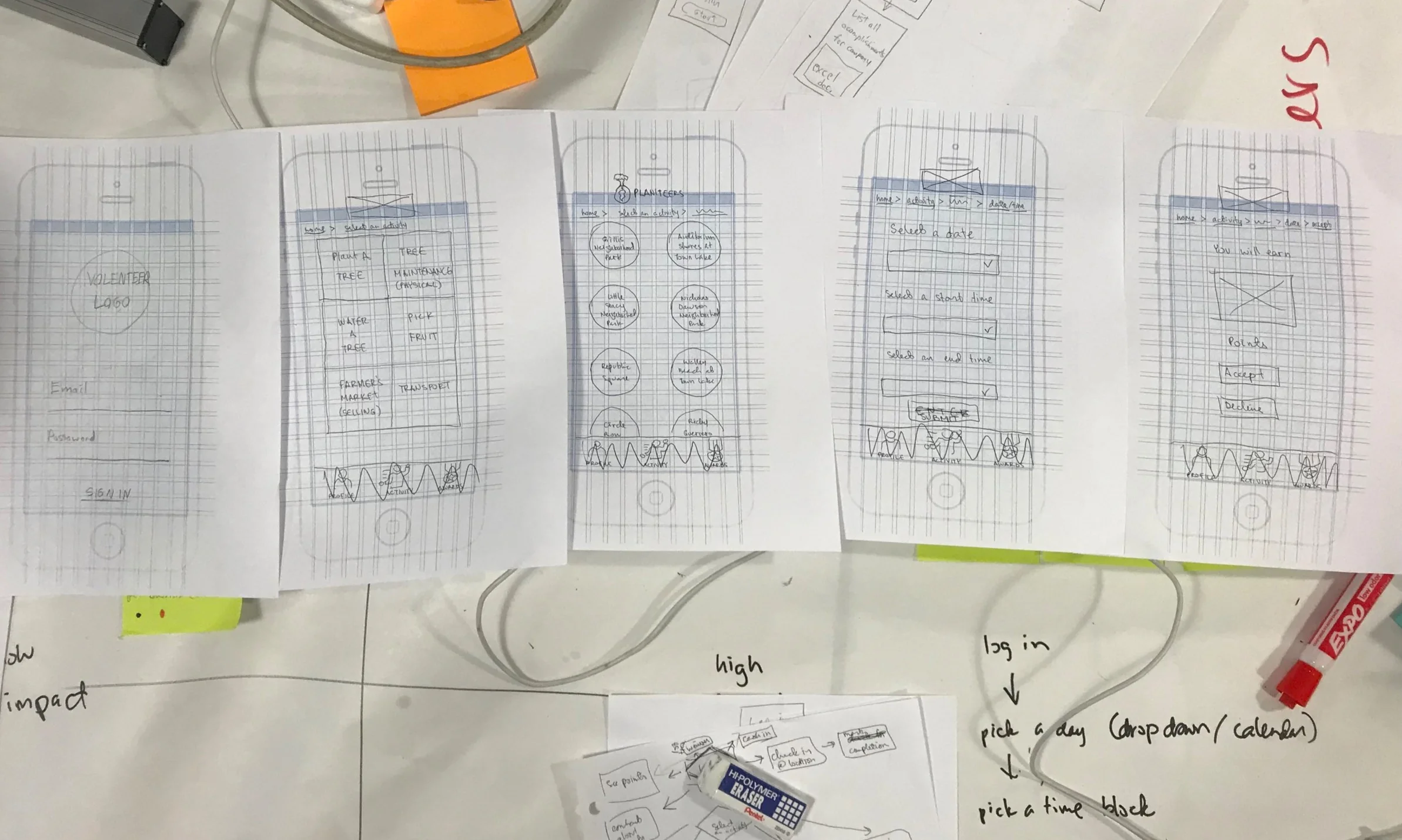
Originally we were focusing on the website being usable for a mobile experience. This was due to people needing to check in at the volunteer location and similar issues. We created these wireframes together as a team, but these are drawn by myself (except for the first wireframe, which was drawn by Gerald). We used these to do usability testing and to ensure that it functioned in a way that made sense. We also made adjustments based on the feedback. People wanted to be free to choose in a different order. Instead of picking a task first, they wanted to choose a location, or a time. We ultimately allowed for these to be accounted for.
The important screens are logging in, choosing an activity, choosing a location, choosing a date / time, and approving the activity details. These screens are hand drawn above and were used to start on the wireframes below.
We also removed some of the screens that would allow the user to check in at the volunteer site because of the developer’s resources and to hone in on our MVP.
Role: wire framing and collaborating
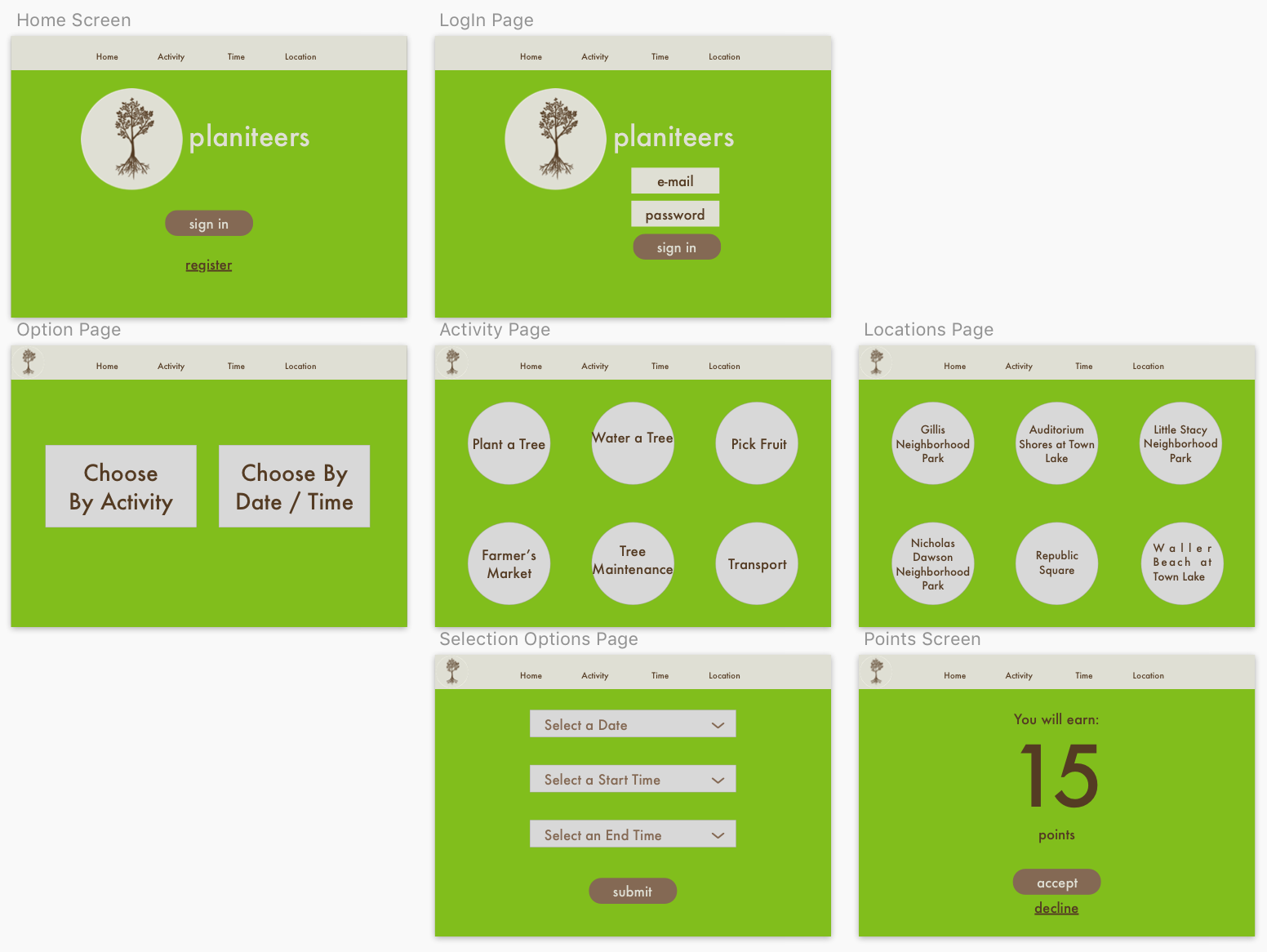
These are the final considerations for wireframes based on the style guide and user flow that we worked on. We have incorporated the user feedback and created simple screens for our pages. These are the screens that were given to our developer and drawn by myself (in Sketch) after the group time was completed.
Role: wire framing and Sketching solo
If this were to be fully developed, there are a lot of things that we had to leave out that we would want to incorporate. There is currently no real back end to save the user profiles, points, and other data. We would want to involve businesses to fund the points and allow them to be redeemed for items as well as donating supplies and other things to keep the project moving. We would also want the city to be involved so that land could be donated for use. For such a short time period, there really weren’t any major obstacles. Everything that we needed to make hard decisions on were made by our developer based on resources. The main resource was time, and there is only so much that one developer can accomplish in a night. I thoroughly enjoyed this project and the results.
We were four individuals that were entrusted with designing a solution for a coffee enthusiast. What that means is that needed to identify problems that a coffee drinker might have and then create a solution for that problem. This was a four day project to complete the iterative process and present it.
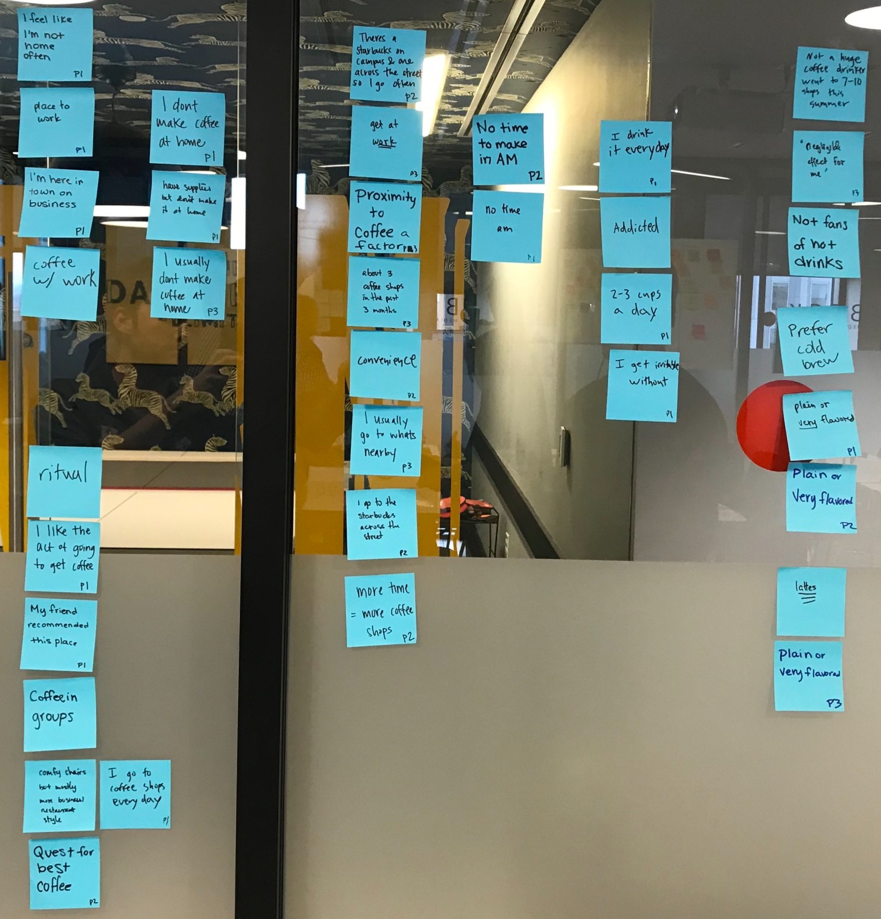
We started as a group by going to a coffee shop and observing individuals. We looked at the flow of the customers as they came in, made orders, and what they did after this. We looked at the baristas, what their interactions were, and what happened throughout their job.
Ultimately, we decided to focus on the reasons that someone goes to a coffee shop. We formed some questions together, made edits, and rewrote the questions. We tried to make these questions open ended to get as much from the interviews as possible, as well as trying to make them more conversational.
Role: note taking
Here are some of the statements or relevant information from the user interviews. We started to look at the details of what they were saying to put them into categories and to determine why these are categories at all.
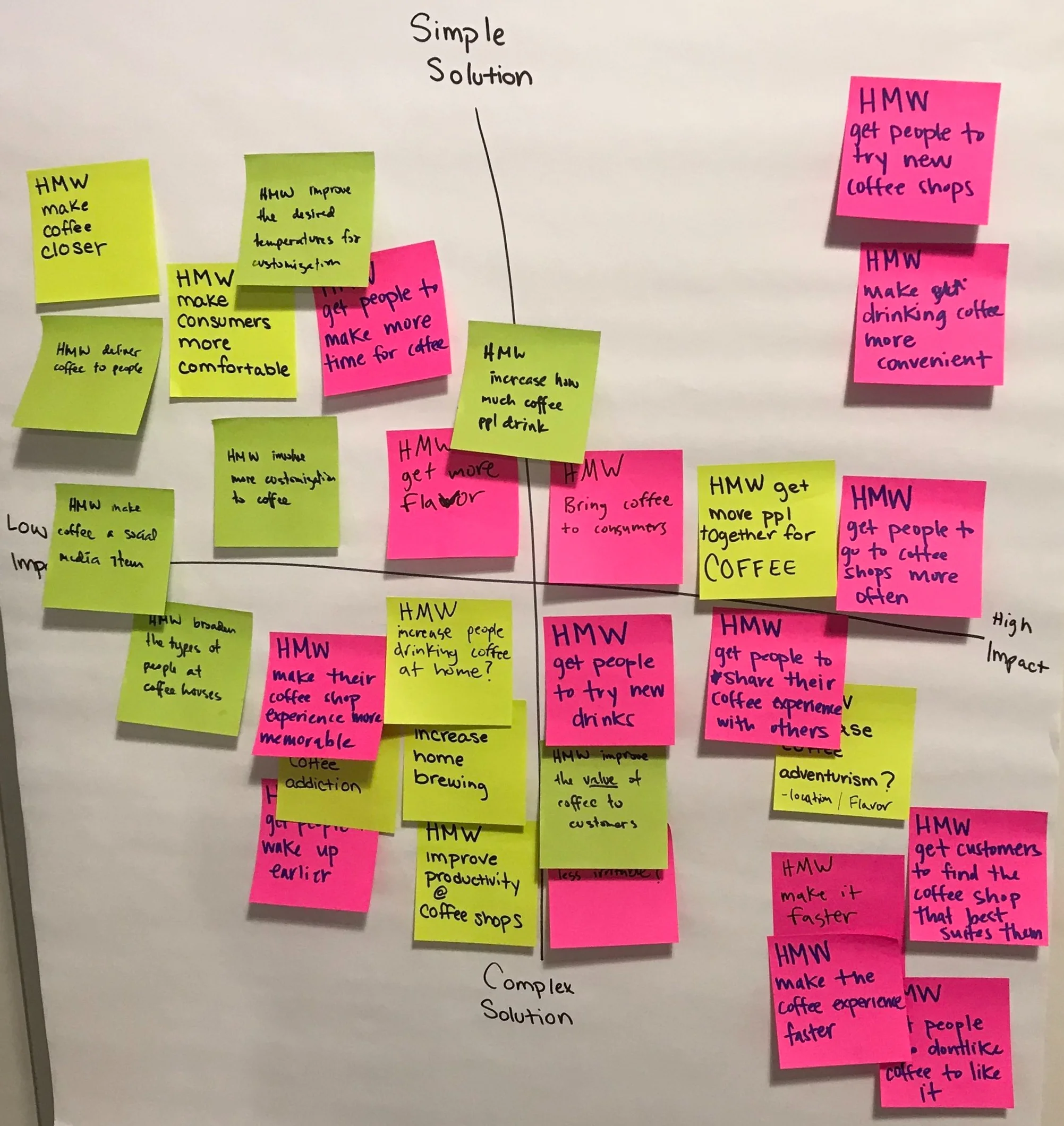
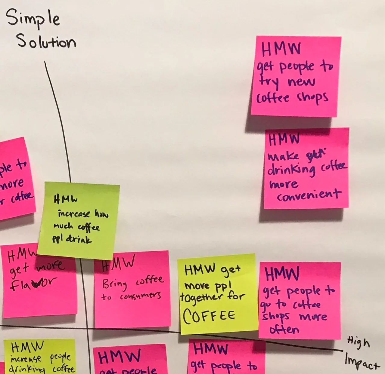
Looking at our affinity map, we determined any questions that were uncertain. In looking at things we weren’t sure about, we could look for solutions to these issues. Here, we organized for simple and complex situations as well as if the solution is low impact or high impact. We wanted something simple and high impact to be easiest for the user and yet more impactful on their experience.
Role: writing HMW statements, participating in charting them
Let’s look at the main ideas that came out of affinitizing and charting:
-increase coffee consumption
-ease of use for getting coffee
-get people together for coffee
-increase coffee shop visitation
The one that the research showed as important and appealing as a problem for me was getting people together for coffee. We already have things such as social media where people can get together, and specifically for coffee, but incorporating the social aspect and a savings for the users sounded appealing to me. Apps such as Five Star can give you discounts but not a group invitation. Social media can allow for group invitations, but not necessarily discounts. This is the direction that I pursued.
Role: ideation
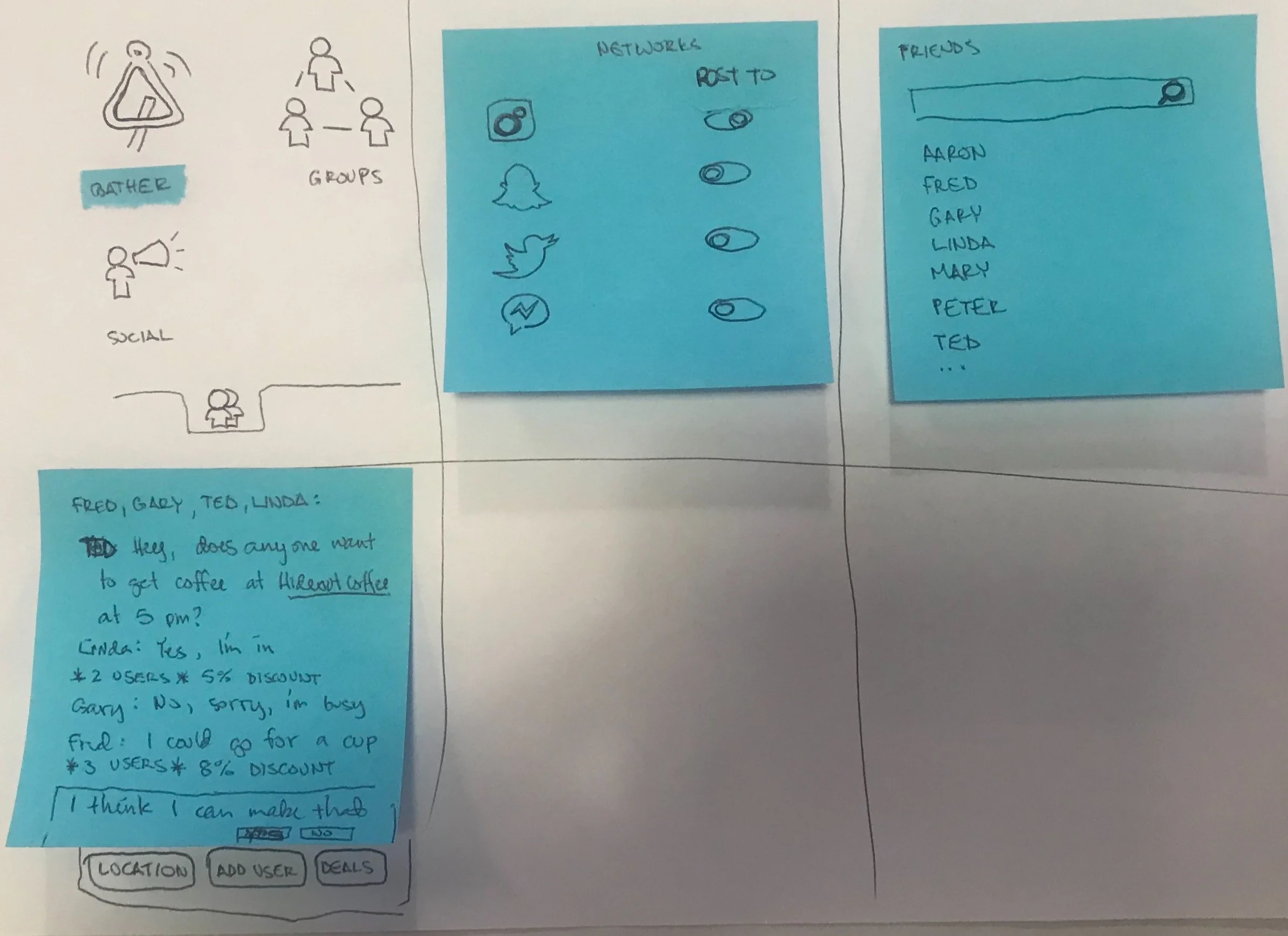
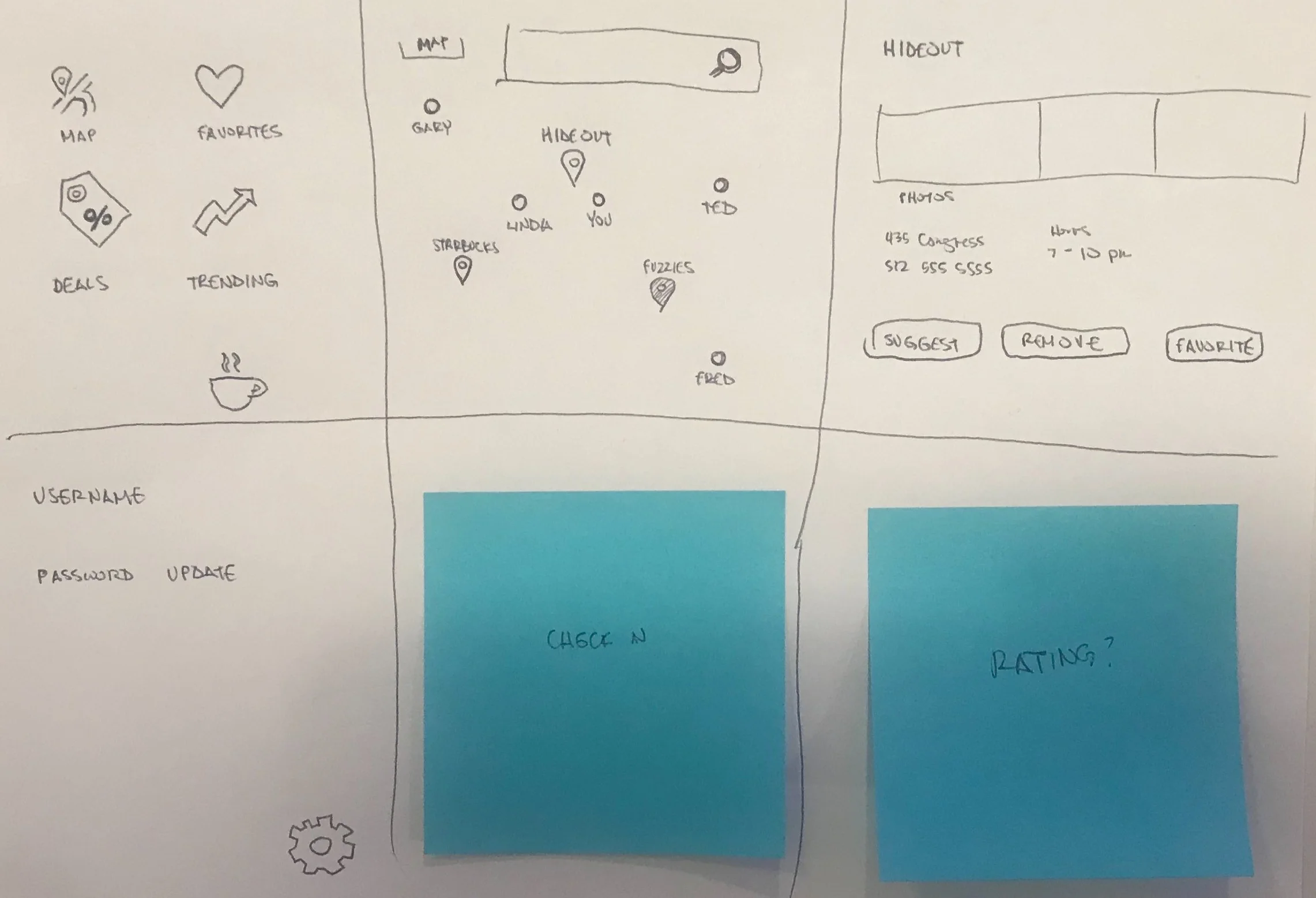
To make sure the process is as agile as possible, I started with paper prototypes. I put my ideas down quickly. I put the screens in front of potential users. When someone was confused about a process or feature, I made note of it and thought about how to correct it for future users. Sometimes I would change an icon and the user was expecting something more like the previous icon. Normally, I would work in low fidelity prototypes before I started working on logos and specific phrasing, but for this project I deviated from that for a faster turnaround. From speaking to users I don’t think this significantly impacted on the user testing.
Many of the original features were either confusing, or unnecessary for the MVP. The home screen was changed to reflect a clean entry point to the app. Other features became “next steps” for when the app has already been rolled out and is functioning well.
This goes a little beyond the original paper prototype. Now, all of the screens are separated into individual phone screens. This allows me to keep the rest of the app hidden until a user “clicks on” something. Working through this process, I was able to further clarify what specifically wasn’t working for users and what changes needed to be made.
Here are some of the highlights of the App that was presented to the General Assembly Design Immersive course.
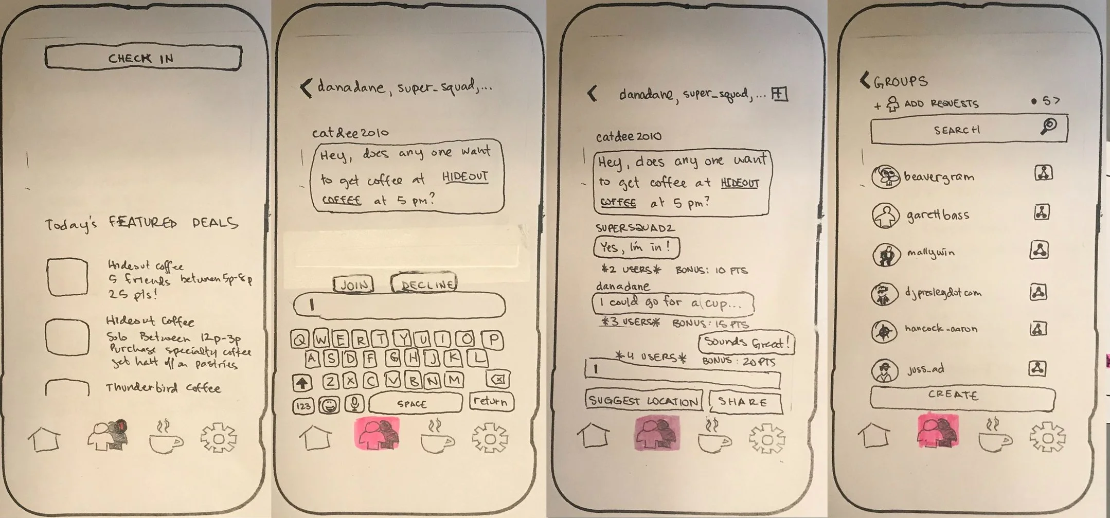
-The ability to chat to an individual or a group
-The ability to get discounts based on the group
-The ability to check in to the location to receive the points
This was a good first run through, but it still needed some clarification. After the project was over, I came back and reworked the product to focus on the MVP and streamline the process. I then created some digital wireframes in Sketch and an interactive prototype in Invision.
Progressive Disclosure is the understanding that when and how information is available is just as important as what is available. If you tell me how to make a mahogany bench while I’m riding my bicycle, it probably won’t be very helpful. The same goes if you give me all of the steps at once while I’m at a workbench and don’t repeat the steps. I’m sure to forget a step or misinterpret exactly what I’m supposed to do. In that lens, I need to be careful about how much information is presented, how I provide that attention, why it’s important that the user has this information, and that determines when it’s important to a user.
In the image above, the left has all of the information given at once and the images to the right are breaking that information into lots of chunks. I’ll talk about all of those chunks individually so that it is easier to follow.
Removing unnecessary information also removes roadblocks from an inquirer becoming an actual user.
When someone visits your site, there are many things that they may be interested in. They may want to know what it is that you do, how you do it, and who the intended audience is. Less of the visitors want to know about your background, your origin story, or how the company came to be. These other items can be removed to an about page instead of the main page.
In the above image on the left, the existing site gives information about how the platform looks on different screens as well as a high-level explanation of what the site is for. On one level, there’s nothing wrong with what is provided. You can see what you would be using, you can read about what it’s used for. But, on another level, it’s completely wrong.
Most publications are written for an 8th grade reading level. This is what people are used to for news articles, magazines, and most things that aren’t academic journals. The reading level is too high, and there are too many confusing sentences. How the information is given to the reader is just as important as why and when.
In the redesign, the reading level was brought down significantly to allow more clarity and to reach more individuals. The section that is left on the main screen is more of a philosophical explanation of what Alcye is than the previous explanation. The remainder of explaining Alcye is moved to another page on the site. The images are removed and an explanation of the screens is done with a video to explain what it is doing in a simpler fashion. What the site is and does is broken into key segments and some of those parts are hidden until the reader wants them. When they do want them, they are located in the navigation and clearly marked.
There are many things that you can learn about a product. You can learn:
-what it does
-how it can be used
-the history of why it was developed
-the philosophy of the product itself
Most people only want to know what it does and how it can be used. This means removing the copy provided from the main page and separating the what and how to remain on the main page. This other information is available to someone that is curious or wants to research more before inquiring, but not forced upon those that are not interested.
In the current climate, users are hesitant to give you their information. There has to be a level of trust in order for someone to give you their email, phone number, or anything else. Why? Data has been mined to steal identities, spam users, or even to sell them other things. People won’t give you their information if they aren’t positive that their information will be used appropriately.
Why are we asking for their information on the home page? Because currently there is just one page unless you have a log in. Do they know what it is used for? Not really. Do I need to give you my phone number and email? Do I have a choice of how I will be contacted? When will I be contacted? These are things that came up in user testing and we addressed in the prototype.
Let’s look at the revisions:
-the phone number is removed
-the contact request is moved to it’s own page
-there are multiple contact options, harnessing social media log ins
-information is given to how long it will take for contact and an assurance of data use
Data science shows that users are more likely to complete a contact if it’s through something that they already trust. Companies are more likely to be legitimate if they have these other platforms and are active with them. Also, users are now knowledgeable about why they should give me their information.